The Trial Run
1. Homepage First-Impression Test
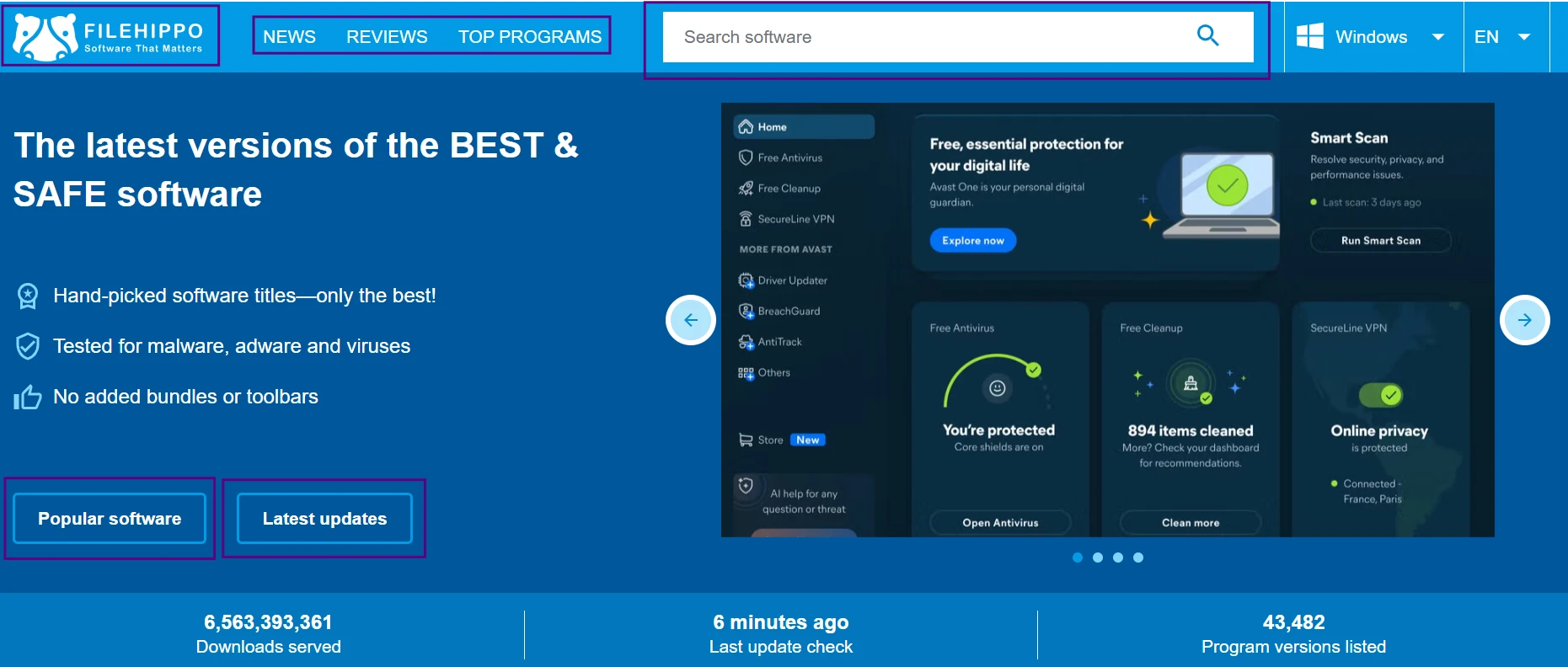
The screenshot shows FileHippo’s homepage and how the site presents software to a first-time visitor. I checked this without downloading anything, just to see whether the layout feels clear and safe to browse. The page still has the old software-directory feel, which makes it easy to scan, but users need to pay attention to where each link leads before clicking deeper.
2. Search Results Clarity Test
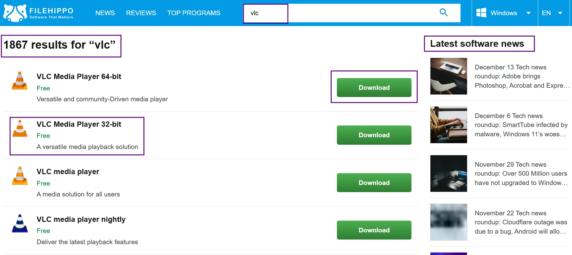
The screenshot shows how FileHippo handles a basic software search. I used this to check whether the correct app appears clearly or whether the page makes the choice feel uncertain. This is a safe test because it does not require downloading anything, but it still shows whether the site is easy to trust at the browsing stage.
3. Older Versions Visibility Test
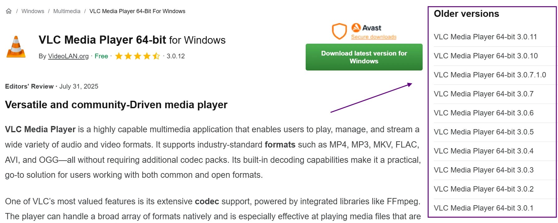
The screenshot shows FileHippo’s older versions section, which is one of the main reasons people still use the site. I checked whether older releases are easy to identify without clicking into downloads. This is useful for users who want to roll back to a previous version, but the labels need to be very clear so nobody mistakes an old release for the latest one.
4. Download Button Truth Check
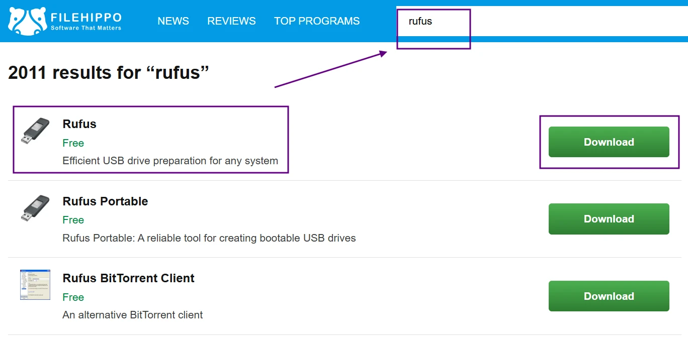
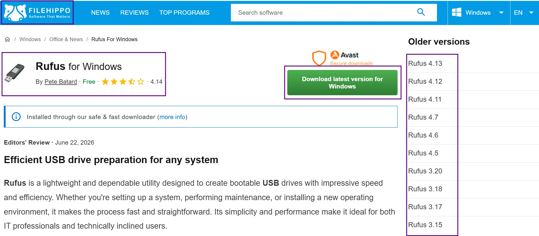
The screenshot shows the main FileHippo download area and what happens after clicking through. Does the button take me straight to the expected file, or does it open another layer first? This matters because the page looks simple at first glance, but the actual download path is where trust is either built or lost.