
Inside a Real Prezi AI Run
I opened Prezi AI 3.0 and gave it one prompt: a five-slide deck on the future of artificial intelligence, aimed at business professionals, with a modern, futuristic look. Before generating anything, the interface tacked on two suggestions of its own. A word cloud for the audience to share their thoughts on AI. A poll asking them to vote on where AI is headed. I hadn’t asked for either, so I left them in and hit generate.

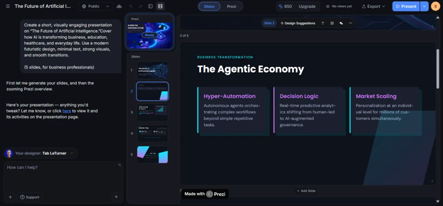
Generation started within seconds. A row of five thumbnails filled in along the left panel while the title slide rendered live on the canvas behind it, a dark network graphic under the headline “The Future of Artificial Intelligence,” tagged “Strategic Briefing 2026.”

What Five Slides Delivered
The deck that came back looked competent rather than inventive. Slide two, “The Agentic Economy,” split into three cards, opening on Hyper-Automation and closing on Market Scaling, each running two sentences on how AI shifts decision-making and personalization at scale. Slide three, “Clinical-Grade Intelligence,” paired a 90 percent documentation-accuracy stat with a filled area chart climbing from 2023 to 2026 on an AI-integration axis. The chart rendered cleanly, axis labels and gridlines included, though nothing in the tool let me check where the underlying figures came from. The card copy read confidently but generically: a line like “real-time predictive analytics shifting from human-led to AI-augmented governance” could drop into almost any AI slide deck without edits.

Slide five broke the pattern. Instead of another card layout, it closed on a full equation, “Value = Human Strategy × AI Execution,” set in large serif math type against a dark background. It read more like a keynote closer than a business briefing slide. The equation makes a claim it never proves, but visually it worked as a mood break inside a fairly uniform generation.

Picking a Designer, Running a Second Deck
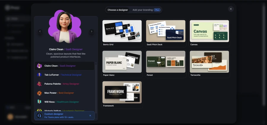
Before testing a second prompt, I opened the designer picker. Prezi frames its themes around named personas instead of plain style labels: Claire Clean handles spacious SaaS-style layouts, Tab LeTurner covers technical decks, Paloma Palette leans artsy, Max Power goes bold. The persona names and short bios read like marketing flavor text more than genuine design signal, but the preview thumbnails did the real work of deciding which one to pick.
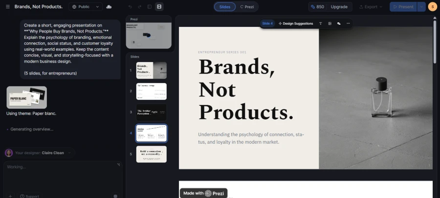
I picked Claire Clean and her Paper Blanc theme, then ran a second prompt on the psychology of branding, aimed at entrepreneurs this time. The result shared nothing visually with the first deck. Cream backgrounds replaced the dark futuristic palette, and serif display type replaced the sans-serif headlines. The title slide carried a generated photo of a perfume bottle on a concrete surface instead of a network graphic.
A Different Deck, A Different Structure
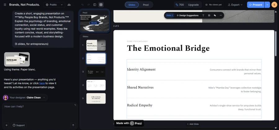
The second deck also broke from the first deck’s card-grid habit. Slide two, “The Emotional Bridge,” ran a three-row list instead, opening on Identity Alignment and closing on Radical Empathy, the middle row citing Nike’s “Mamba Day” campaign as an example of shared narrative. Slide three dropped structure almost entirely: one oversized word, “Apple,” set beside the headline “The Insider Perception,” with a short paragraph on brand ownership as social signaling. It’s a little theatrical for a psychology explainer, but the only slide in either deck that took a real typographic risk.
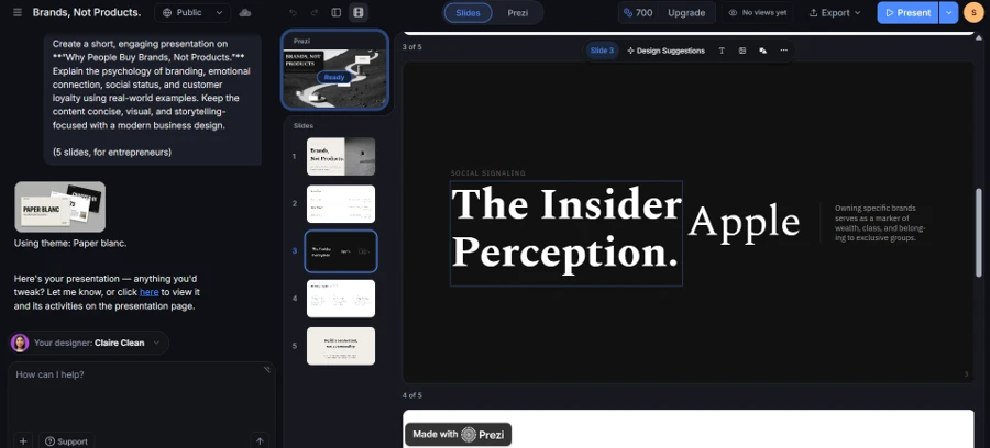
Two prompts into the same account, on the same generation engine, and the outputs read like they came from separate design teams.
Editing After Generation
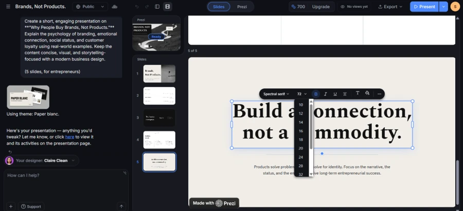
Generated text stays fully editable once a deck lands. I clicked into the closing headline of the second deck, “Build a connection, not a commodity,” and a font panel opened inline: typeface, size, weight, and alignment controls, no separate settings screen to hunt through. Changing the headline from 72 points down to 32 took one click on the size dropdown. The panel matched what a designer would expect from any modern editor, nothing unusual, but nothing missing either.
The Canvas View
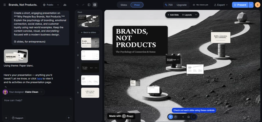
Switching from the slide editor to the “Prezi” tab showed the part that separates this tool from a normal deck builder. All five slides sat as stops along a winding path rendered in three dimensions, each thumbnail mounted on its own pedestal and numbered 01 through 05. Pan and zoom controls sat along the bottom, letting me move along the path stop by stop instead of clicking through slides in a straight line. A tooltip labeled “Check out each slide using these controls” pointed at those icons, confirming this view is meant to be explored, not just admired. This is the one screen where Prezi’s zooming-canvas pitch shows up as something you can use rather than read about.
Credits Spent Testing
Two five-slide decks used 300 credits between them, dropping the starting balance from 1,000 to 700. The usage log confirmed it directly: “Craft presentations: 2.” At that rate, a working month of ten or twelve decks would run past the free allotment fast. The upgrade modal that appears when checking the balance quotes $3 a month for unlimited generation, billed annually, but that price is tied to the Prezi EDU Plus tier, not the standard consumer or business plan. For a reviewer running test after test, that distinction matters more than the headline number. Free-tier limits show up fast once real usage starts.