

Our Blaze AI Trial Walkthrough
We signed up for a fresh trial, entered one of our own websites, and let Blaze do its thing. Below is every screen we went through, what we thought at each point, and what went wrong at the end.
The homepage pitch
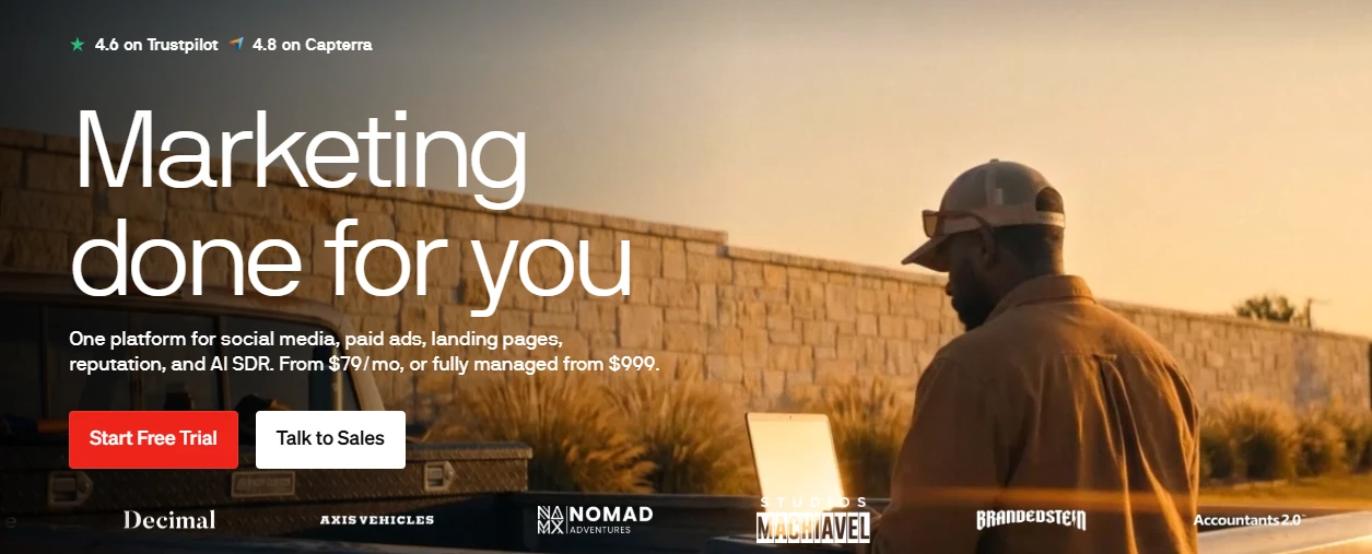
Figure 1: Blaze homepage — "Marketing done for you" with Trustpilot and Capterra ratings and starting prices.
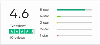
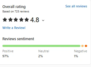
What we noticed: The hero is confident and clear. It tells you what the product covers (social, paid ads, landing pages, reputation, AI SDR) and gives pricing upfront: from $79/month self-serve, or fully managed from $999. Social proof is right there — 4.6 on Trustpilot and 4.8 on Capterra plus a logo strip of customers.
Liked: No hidden pricing. You know the entry cost before clicking anything. Two clear CTAs (Start Free Trial / Talk to Sales) with no clutter.
Disliked: The $999 managed tier is a big jump from $79 with nothing in between visible on this screen. The logo strip is small brands most people won't recognise, so it doesn't add much trust.
Our take: Solid first impression. It positions itself as an all-in-one marketing engine rather than just a writing tool, which sets expectations high for what follows.
Sign-up
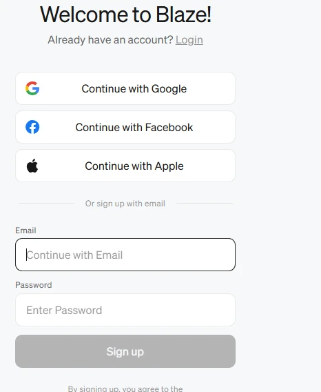
Figure 2: Sign-up with Google, Facebook, Apple, or email.
What we noticed: Standard sign-up. Google, Facebook and Apple single sign-on, or email plus password. No credit card asked at this stage.
Liked: Quick. No card required for the trial, and no long form before you get in.
Disliked: Nothing to complain about here, it is a plain sign-up screen.
Our take: Frictionless. Took under a minute.
Personalisation questions
What we noticed: Three questions only: your name, your monthly marketing budget (we picked $0–$500), and your business category (we picked Agency).
Liked: Short. Most tools drag this out over five or six screens; Blaze keeps it to one.
Disliked: The budget question is almost certainly a sales-qualification field rather than something that changes the product. Asking it this early feels like being sized up. The "Agency" category also did not seem to change anything downstream.
Our take: Harmless, but we would rather these questions were optional.
Enter your website
What we noticed: Blaze asks for a single URL and promises to handle the rest. We entered GeniusFirms and hit "Analyze my business".
Liked: This is the right approach. Instead of asking you to describe your brand in a text box, it goes and reads your site. It ran in well under a minute.
Disliked: No option to add a second URL, a social profile, or a document at this stage. If your website is thin, Blaze has thin input to work with.
Our take: The most important step of the whole onboarding, and it is one field. Good.
Confirm the basics it pulled from your site
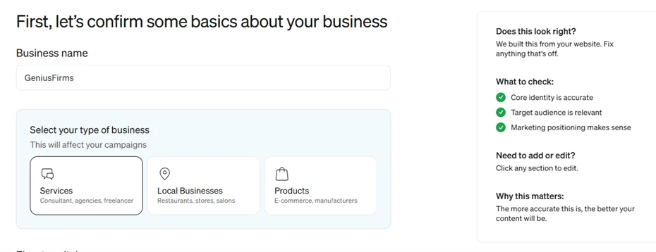
Figure 5 Business name detected as GeniusFirms; business type set to Services.
What we noticed: Blaze correctly picked up the business name and defaulted us to "Services" (consultants, agencies, freelancers) rather than Local Business or Products. The right-hand panel tells you what to check, core identity, target audience, positioning and says the more accurate this is, the better the content will be.
Liked: It got the business name right and the business-type guess was correct for a review site. The side panel is a nice touch, it explains why you are being asked to check this.
Disliked: This screen only shows the name and type above the fold. The audience and positioning sections were further down and easy to skip, which matters because everything later depends on them.
Our take: Accurate detection. We made no edits and moved on.
Pick a content strategy
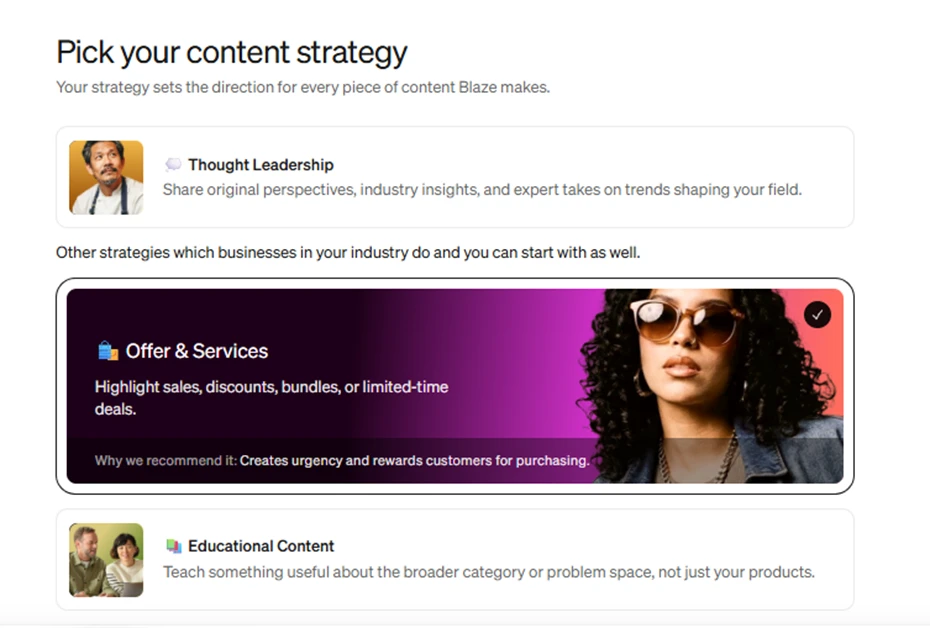
Figure: Thought Leadership, Offer & Services (recommended), and Educational Content.
What we noticed: Blaze offers a strategy that shapes every piece of content it makes. Three were shown: Thought Leadership, Offer & Services, and Educational Content. It pre-selected Offer & Services with the note that it "creates urgency and rewards customers for purchasing".
Liked: Having a strategy layer at all is sensible, it stops the output from being a random mix of post types. Each card has a one-line explanation of what it means.
Disliked: The recommendation was wrong for us. GeniusFirms is a review and comparison site, not a store running discounts. Thought Leadership or Educational Content would have fit far better. The stock photos on the cards are also generic and do not help you decide.
Our take: We deliberately left the default in place to see how Blaze would handle it. This is a good test of whether the tool adapts or just runs the template.
First campaign details
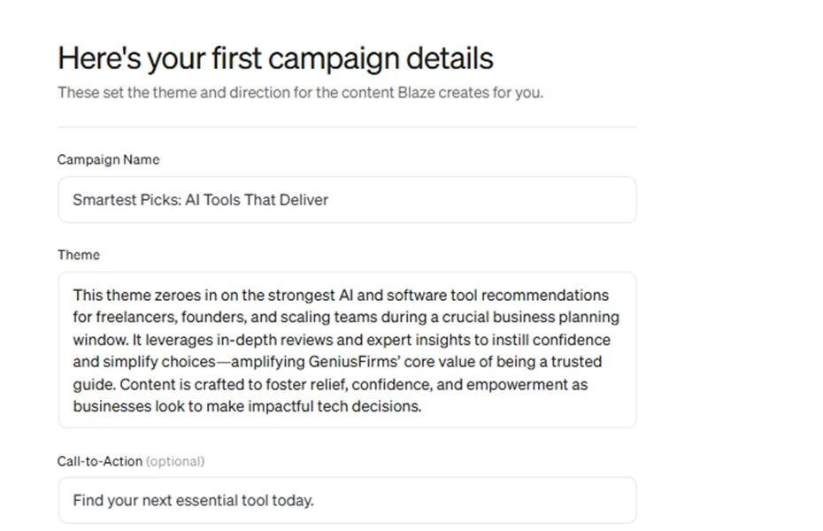
Figure- Auto-generated campaign name, theme paragraph, and call-to-action.
What we noticed: Blaze wrote the campaign itself: "Smartest Picks: AI Tools That Deliver", with a theme paragraph about tool recommendations for freelancers, founders and scaling teams during a planning window, framed around GeniusFirms being a "trusted guide". The CTA was "Find your next essential tool today."
Liked: This is where the website analysis paid off. The campaign name and theme are on-brand for a review site and clearly came from reading our actual pages, not a template. Everything is editable inline.
Disliked: The theme paragraph is a bit of marketing-speak ("foster relief, confidence, and empowerment"). It reads like a brief written by an agency intern rather than something you would show a client. The "business planning window" angle was assumed, not asked.
Our take: Impressive for a zero-effort output. This screen was the high point of the onboarding.
Channels and scheduling
What we noticed: Instagram, Facebook, LinkedIn and X were pre-ticked for feed posts, plus Blog and Newsletter for long-form. Google Business Profile, Stories, Reels, TikTok and YouTube were available but unselected.
Liked: Wide channel coverage in one place, including email and blog — most social schedulers stop at social. Toggling is instant and you can change it later.
Disliked: It did not ask whether we actually have accounts on these platforms before ticking them. Nothing here prompts you to connect an account, so it is not clear at this point whether "posting" means real publishing or just generating drafts.
Our take: Fine. We kept the defaults.
Recommended first-week mix and credit costs
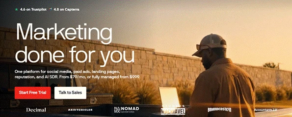
Figure 9: 3 still images + 1 carousel per week = 70 credits; trial includes 200.
What we noticed: Blaze proposed 3 still images (6 credits each) and 1 carousel (24 credits) per week, totalling 70 credits. Feed videos are 40 credits each and were set to zero. The trial gives 200 credits, described as enough for the first week.
Liked: Transparent. You can see exactly what each content type costs before anything is generated. The sliders let you rebalance.
Disliked: The maths is the first warning sign. 200 trial credits at 70 per week is under three weeks of a fairly light schedule, and a single video eats 40. Anyone who wants Reels or AI-avatar videos will burn through the trial almost immediately. The credit model is also going to make the real monthly cost hard to predict on the paid plan.
Our take: Clear, but the credit pricing needs scrutiny before anyone commits to $79/month.
Choose a visual style
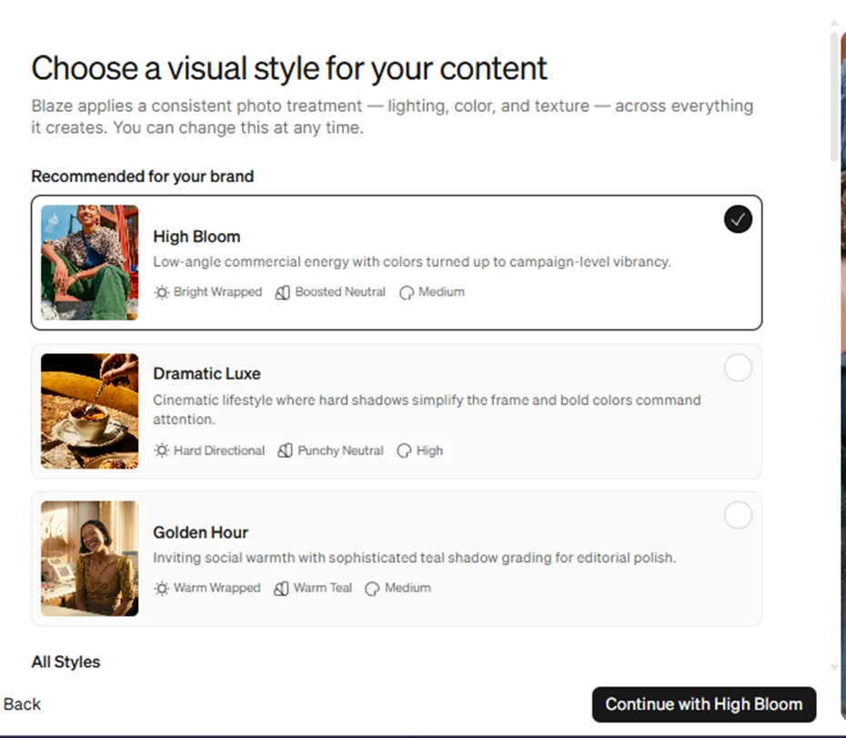
Figure: High Bloom (recommended), Dramatic Luxe, and Golden Hour photo treatments.
What we noticed: A consistent photo treatment applied across all generated imagery. High Bloom was pre-selected as "recommended for your brand", with Dramatic Luxe and Golden Hour as alternatives and an "All Styles" list below.
Liked: Brand consistency baked in from the start is a good idea, and the previews give you a real sense of the look. Each style shows its lighting, colour and contrast settings.
Disliked: The three "recommended" styles all use lifestyle photography of people. For a B2B software-review site that is an odd fit , we would have expected a cleaner, screenshot-led or flat-graphic option to surface first. We had to scroll into All Styles to find anything more corporate.
Our take: Went with High Bloom to see the default output.
Topics and reference images
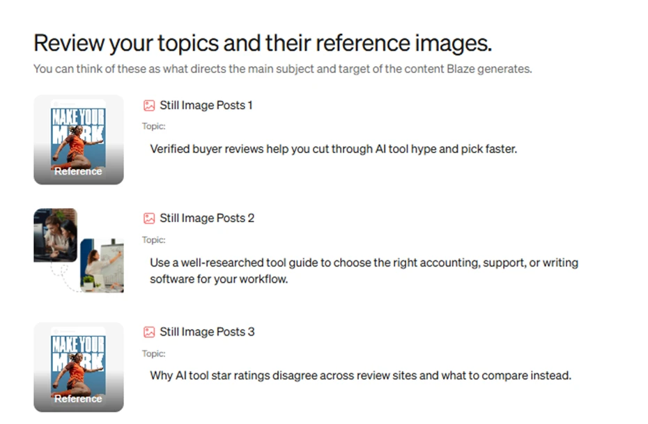
Figure : Three still-image post topics with their reference images.
What we noticed: Blaze generated three topics: verified buyer reviews cutting through AI tool hype; using a tool guide to pick accounting/support/writing software; and why star ratings disagree across review sites. Each topic had a reference image attached.
Liked: The topics are relevant. Topic 3 (why ratings differ across review sites) is exactly the kind of angle a review site would actually write about — it shows the site was read properly, not skimmed.
Disliked: Two of the three reference images were the same "Make Your Mark" stock poster of a dancer, which has nothing to do with AI tools or reviews. The reference images appear to be picked from a generic library, not from our site or the topic.
Our take: Strong on words, weak on visuals, a pattern that continued.
Step 12 — First posts appear on the dashboard
What we noticed: Within a few minutes the dashboard showed four scheduled items: an email ("FY Planning Shortcut: Verified Reviews That Cut...") for Sep 15, a still image ("Verified reviews cut through AI hype") for Sep 15, and two more — a still image for Sep 16 and a carousel for Sep 18 — still marked Generating with a 5:09 timer.
Liked: The two finished pieces looked publishable. The still image had a clean headline, a readable sub-line and a relevant photo of someone at a laptop. The email copy tied fiscal-year planning to choosing AI tools, which fits the site's audience. Everything was auto-scheduled with dates and times, and each item has a Review button.
Disliked: Both finished posts already carried a yellow warning triangle next to Review, meaning Blaze itself flagged something for attention before we had touched them. The 5:09 countdown on the remaining two was already looking optimistic.
Our take: Two out of four in a few minutes is a fair start. Then it stopped being fair.
Generation failed
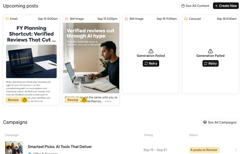
Figure 13: The remaining still image and carousel both ended in "Generation Failed" with a Retry button.
What we noticed: About twenty minutes later, the two pending items had both flipped to "Generation Failed" with a Retry button. The campaign row below showed "4 posts to Review" even though only two existed. We clicked Retry on both. The cards went back to Generating, sat there for several more minutes, and failed again. We tried a second retry with the same result. At that point we stopped.
Liked: The failure is at least visible and there is a one-click Retry. It did not silently drop the posts or charge credits repeatedly as far as we could tell (the balance did not appear to move on retries).
Disliked: Half of the very first batch failed, twice, on a plain still image and a carousel — the two cheapest and most basic formats Blaze offers. There was no error message explaining why, no suggestion of what to change, and no support prompt. For a product whose entire pitch is "marketing done for you", a 50% failure rate on the recommended first week is a serious problem. It also makes the credit maths worse: if you have to retry, you are waiting on a queue you cannot see.
Our take: This is the screen that changed our opinion of the trial. Everything before it was polished; this was not.
Our overall opinion
Blaze's onboarding is one of the better ones we have tested in this category. The website-scan approach produces a campaign and topics that are on-brand without any manual briefing, and the UI is clean throughout. The problem is reliability. When the tool works, it works well; when it does not, you are left with a Retry button and no explanation. Two failed generations out of four, repeated after retry, is not something we can wave away for a product that is asking $79 a month and pitching itself as hands-off. Our recommendation from this test: worth a trial if you have a consumer-facing brand and want to see how the scan handles your site, but check the generation success rate over a full week before putting money down, and watch the credit balance closely.