

AI Bookkeeper for QuickBooks
The landing page
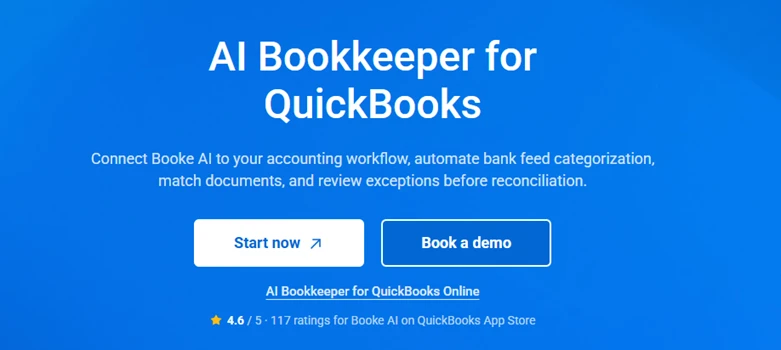
What I liked: The pitch is tight and I understood the product in one read, connect Booke AI, automate bank-feed categorization, match documents, review exceptions before reconciliation. That's a clear, specific promise, not fluff. The 4.6 / 5 from 117 ratings on the QuickBooks App Store is a genuine trust signal and I appreciate that they put it right under the buttons instead of burying it.
What bugged me: “Start now” reads like I can jump straight in and start using it. Hold that thought, that button set my expectations higher than the onboarding actually delivered. There's also no visible “free trial” or “see pricing” anywhere on this hero, so I had no idea what I was committing to before clicking.
The sign-up form
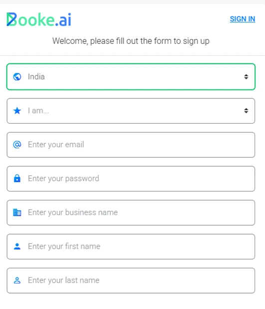
My take: Reasonably short and standard, country, a role picker (“I am…”), email, password, business name, first and last name. Nothing outrageous.
What I liked: Asking for role and business name upfront probably helps them tailor the flow, and the country field defaulting sensibly is fine.
What bugged me: It's a password-on-signup form rather than a lighter email-first / magic-link start, so it's a few more fields than I'd want at first touch. Minor, but every extra box on a first screen is a place people drop off.
Email verification wall
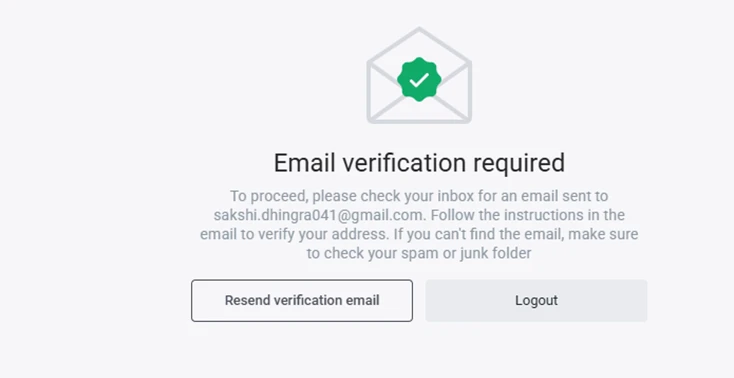
My take: Right after submitting, I'm told to go verify my email before I can proceed.
What I liked: Fine from a security standpoint, verified emails are the baseline, and the “check spam” nudge plus a Resend button are the right touches.
What bugged me: It kills momentum. I was in “let me try this” mode and got bounced to my inbox and back. It's a common pattern, but it's still a speed bump, and combined with everything that comes after, the friction adds up fast.
Signing back in
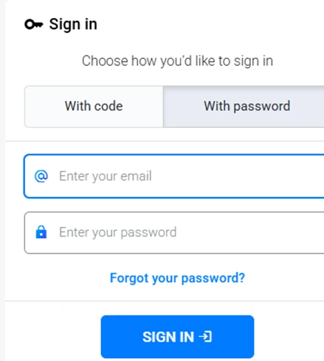
My take: After verifying, I land on a sign-in screen with two options — “With code” or “With password.”
What I liked: The passwordless “with code” option is a nice touch and I'd probably use it over remembering yet another password.
What bugged me: Being sent back to a login screen right after verifying feels like one hop too many. By this point I've done: form → verify email → log in, and I still haven't seen the product.
“How did you hear about us?”
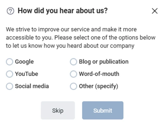
My take: A marketing attribution survey pops up mid-onboarding.
What I liked: At least it's skippable — the Skip button is right there, so it's not a hard gate.
What bugged me: It's still one more interruption between me and the thing I actually came to do. Optional or not, stacking a survey on top of verify-and-login stretches the “just let me in” patience thin.
Onboarding steps, and the payment gate appears
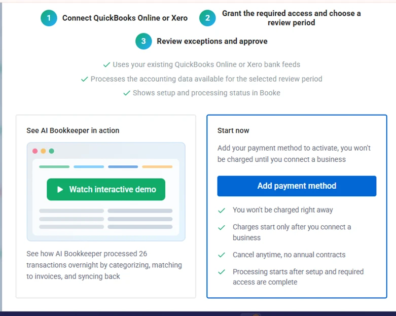
What I liked: The three-step map is genuinely clear: connect QuickBooks Online or Xero, grant access and pick a review period, then review exceptions and approve. The “See AI Bookkeeper in action” interactive demo (26 transactions processed overnight) is a smart way to show value, and the reassurances are well-written — won't be charged right away, charges only start once you connect a business, cancel anytime, no annual contract.
Where the mood turns: Look at the right-hand card. “Start now” actually means “Add payment method to activate.” This is the moment I realized I couldn't just try the product — the very next thing it wants from me is a card. All the soft language around it doesn't change that a payment method is the price of entry to see the product do anything real.
The card form — where my test stops
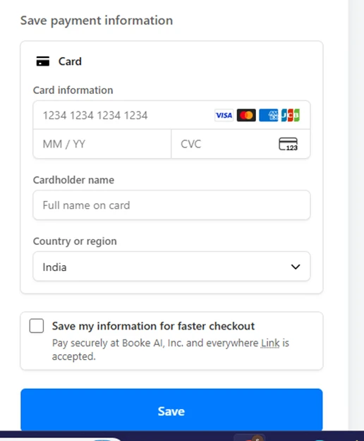
My take: Clicking through lands on a Stripe/Link card-capture form. Card number, expiry, CVC, cardholder name, country.
What I hate: This is the hard stop. To reach the actual bookkeeping features I've been sold on, I have to hand over card details first. As someone doing a hands-on evaluation, I'm not putting a card in just to look around — and plenty of real prospects feel exactly the same. The form itself is clean and clearly Stripe-backed (so the security is fine); the problem is that it exists here at all, before I've seen a single transaction categorized.
The pricing
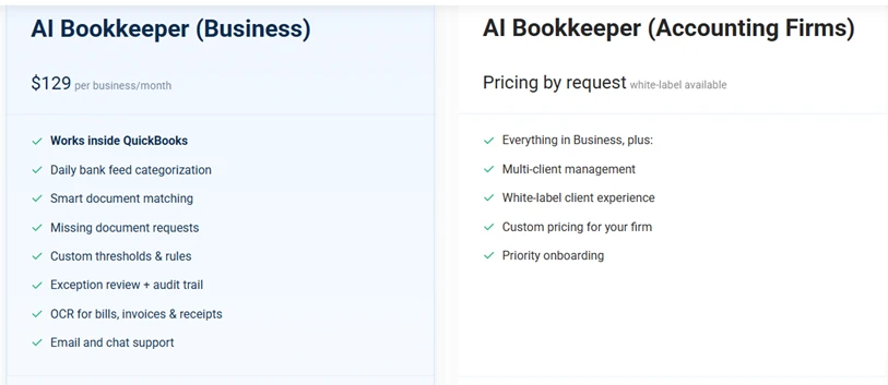
What the numbers are: AI Bookkeeper (Business) is $129 per business / month with a solid feature list — works inside QuickBooks, daily bank-feed categorization, smart document matching, missing-document requests, custom thresholds & rules, exception review + audit trail, OCR for bills/invoices/receipts, email and chat support. The Accounting Firms tier is “pricing by request,” white-label available, with multi-client management on top.
My take: $129/month per business is a real commitment for a small business, and the firm tier being quote-only means you can't even self-assess the cost without a sales conversation. The feature set looks capable — but I'm judging it from a pricing page, not from using it, which is exactly the problem.
The big frustration: no free trial
Here's what genuinely frustrated me. There is no free trial. To even get to the point where the AI does its thing, you have to add a payment method, and that paywall shows up AFTER you've already signed up, verified your email, and logged back in. So you invest all that effort walking through the door, and only then does the product tell you it needs a card before it'll show you anything worth evaluating.
That ordering is the real sin. If a card were required on the very first screen I'd at least know the deal upfront. Instead the flow front-loads the effort (form → verify → login → survey → onboarding) and back-loads the wall, which feels like a bait-and-switch even if that's not the intent. The “won't be charged until you connect a business” language softens it, but a payment method is still mandatory to proceed, and “no charge yet” is not the same thing as “free to try.”
Net result: I could not actually test the thing I came to test — the categorization, the document matching, the exception review. All of that lives behind the card gate. So this hands-on review is, through no fault of my own, a hands-on review of an onboarding funnel, not of an AI bookkeeper.
What would fix it: A genuine free trial, or even a read-only sandbox demo account with sample data, so evaluators (and cautious buyers) can watch the AI process a few transactions before committing a card. Given the pricing is $129/month, letting people see the product work first isn't a nice-to-have, it's the difference between me being able to recommend it and me having to say “clean funnel, capable-looking feature list, but I was never allowed to verify any of it.”