

Putting Krea AI to Work
My Creative Experiments With Krea AI
Krea AI is difficult to judge from a feature list alone because most of its value depends on how it behaves while ideas are still unfinished. A tool can claim fast generation, strong style control, and useful enhancement, but the real question is whether it helps a creator move from a rough visual idea to something usable without fighting the interface.
For this hands-on section, I treated Krea less like a standard AI image generator and more like a creative workspace. I focused on areas that mattered most in the main review.
The goal was not to create perfect images. I wanted to see where Krea felt fluid, where it became confusing, and whether its strongest claims held up during normal creative exploration.
Turning a Small Prompt Into a Complete Scene
What I Wanted To Explore
I started with a simple creative question: Can Krea take a short, natural prompt and turn it into a complete image without needing heavy prompt engineering? This matters because many creators do not begin with a polished prompt. They begin with a mood, a place, or a loose visual direction. If Krea needs too much technical instruction at this stage, beginners may struggle before they even reach the refinement stage.
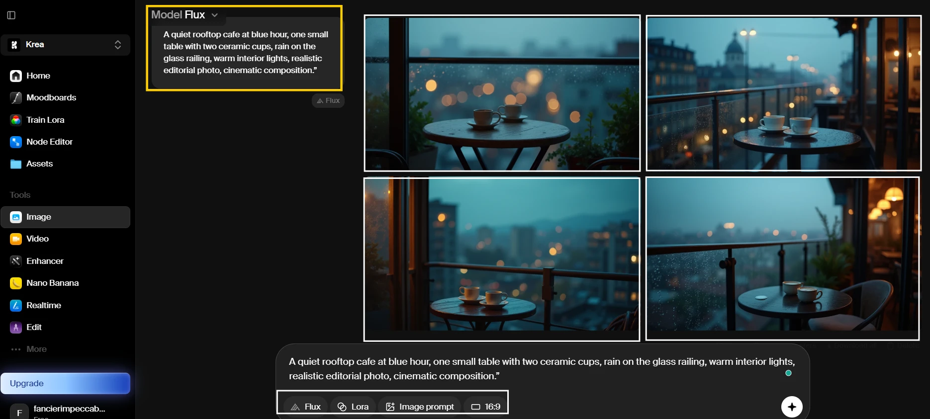
What Appears In The Result
In the result shown above, I can see four different interpretations of the rooftop cafe idea. The images keep the overall evening mood, with warm interior light contrasting against a cooler outdoor setting. The table and cups are visible in the stronger outputs, while the rain detail appears more clearly in some versions than others. The image grid also shows how Krea varies the composition even when the same prompt is used. One result leans closer to a cinematic cafe photo, while another feels more like a polished concept image than a real location.
Behind The Scenes
This was the easiest experiment to run because the workflow stayed close to a normal text-to-image process. I did not need to adjust many controls before seeing usable results. The main friction was deciding which model and setting to use because Krea presents several creative options in the same workspace. The first generation gave me enough visual material to compare direction, but small prompt details did not carry equally across every result. The tool felt fast enough for idea exploration, but not fully predictable.
Creative Insight
This experiment supports the review’s stronger score for image output quality. Krea can turn a short visual idea into a polished image quickly, especially when the prompt describes mood, lighting, and composition. At the same time, it also shows why prompt fidelity is not perfect. Creators should expect useful starting points, not exact obedience to every detail in the first generation.
Exploring Styles From One Prompt
What I Wanted To Explore
For the second experiment, I wanted to see whether Krea could keep the same idea recognizable while changing the visual style. This matters for creators who make thumbnails, ads, album art, moodboards, or campaign visuals. A good creative tool should let the user explore different directions without rebuilding the entire prompt each time. I was especially interested in whether the subject stayed consistent or became a completely different concept after each style change.
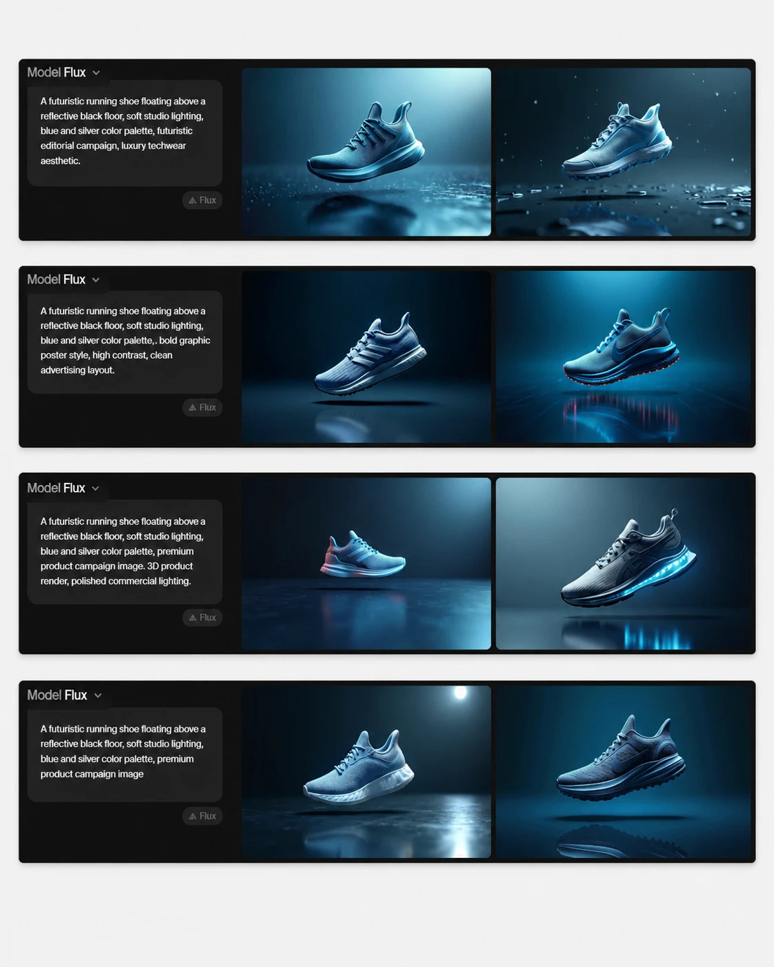
What Appears In The Result
In the result shown above, the main object remains a futuristic shoe, but the surrounding visual language changes noticeably between styles. The realistic version shows a cleaner product photo setup, with stronger lighting and a more believable reflective floor. The graphic version pushes the shape and contrast further, making the shoe look closer to a campaign poster. The blue-and-silver palette appears across the stronger outputs, although the exact shoe design varies between generations. The screenshot also shows that Krea treats style as a broad creative direction, not as a strict template.
Behind The Scenes
This experiment made Krea feel more like a visual exploration tool than a single-output generator. Changing the style quickly gave me a wide range of options, which is useful when the creative direction is not yet fixed. The trade-off is consistency. The shoe did not remain exactly the same from one style to another, so this would not be enough for a strict product campaign without extra reference images or editing. For moodboards and early concepts, the speed helped more than the inconsistency hurt.
Creative Insight
This experiment supports the review claim that Krea has a strong creative range and useful style control. It also challenges the idea that Krea is automatically reliable for production work. The tool is good for exploring multiple directions from one prompt, but creators who need the same object preserved across styles may need a more controlled reference-image workflow.