DeeVid AI - Image Generation Hands On Testing
Image 1: Landing page
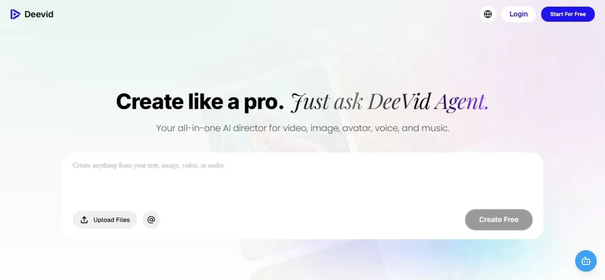
I started on the entry page, where the "Create like a pro. Just ask DeeVid Agent" tagline sat up top with "Your all-in-one AI director for video, image, avatar, voice, and music" beneath it. A large create box dominated the center, offering to upload files or tag with @, and a "Start For Free" button waited in the top right. The soft pink-to-blue gradient and uncluttered layout kept me focused on a single action, typing an idea, and I liked that nothing stood between me and just getting going.
Image 2: Main console
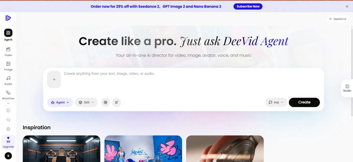
After signing in, the full workspace opened up. I found a left rail with the core modes (Agent, Video, Image, Audio, Workflow), and a credit counter with an Upgrade button anchored at the bottom. The create box returned, now backed by an "Agent" selector, a "Skill" menu, and an "Ask" mode, plus a black "Create" button to fire it off. A "Studio" tab tucked into the right edge, and an Inspiration feed below showed sample outputs across fitness, street art, and product shots. A promo banner up top flagged newer models like Seedance 2 and GPT Image 2. I noticed every format lived in one panel without feeling crowded, so I got my bearings quickly.
Image 3: Prompt + generation queue
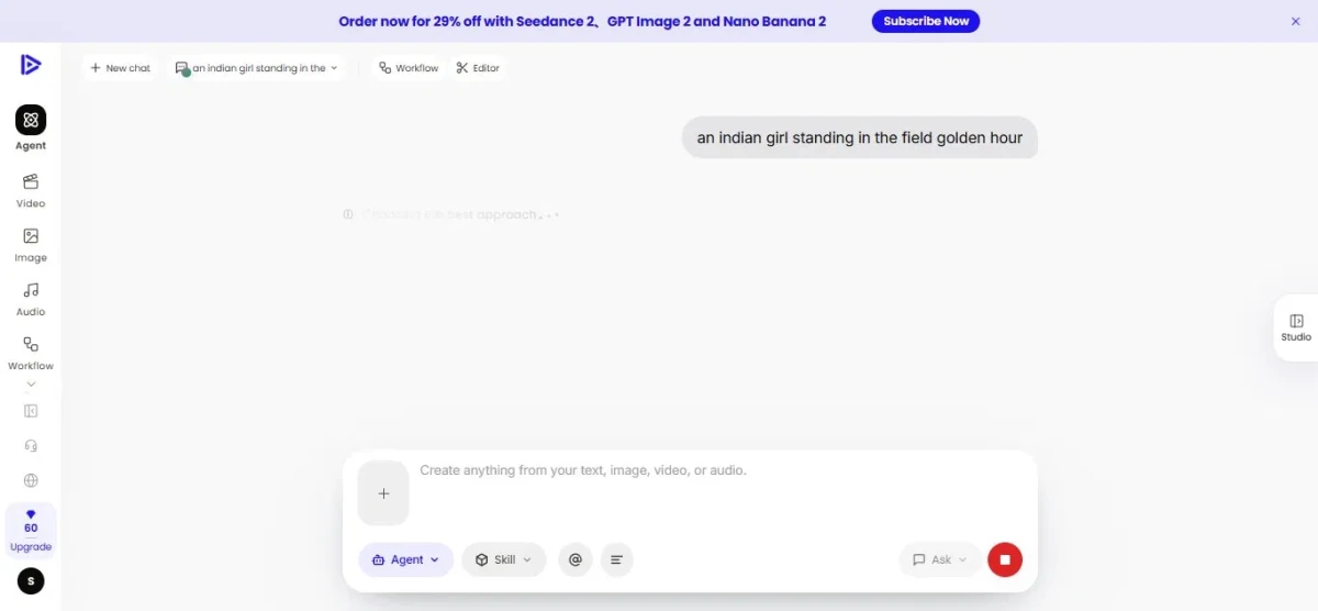
I typed in my prompt, "an indian girl standing in the field golden hour," and it appeared as a message on the right. The agent responded with a "Choosing the best approach" step while it worked, and a red stop control showed up in the input bar so I could halt generation at any point. Seeing that decision step surfaced made the process feel transparent rather than a black box, which I appreciated while testing.
Image 4: Automatic prompt enhancement
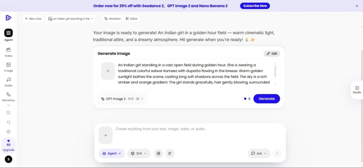
This was the stage that stood out most. My one-line prompt got expanded into a detailed, generation-ready brief: a vast open field at golden hour, a traditional colorful salwar kameez with a dupatta flowing in the breeze, warm sunlight casting long soft shadows, and a rich amber-orange sky. The Generate Image card laid the setup out clearly, with GPT Image 2 selected, a 9:16 ratio, 2K resolution, and a 6-credit cost, plus an Edit option to fine-tune before committing. I was impressed at how it filled in what my weak prompt left out, though I also noticed it made a lot of creative choices on my behalf.
Image 5: Final output
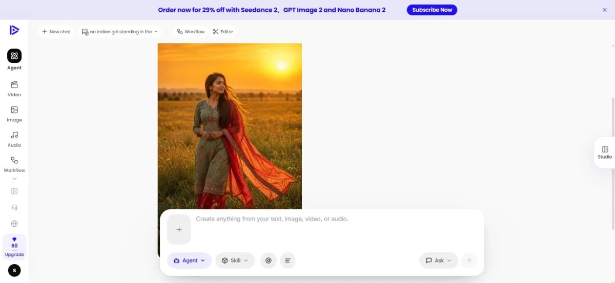
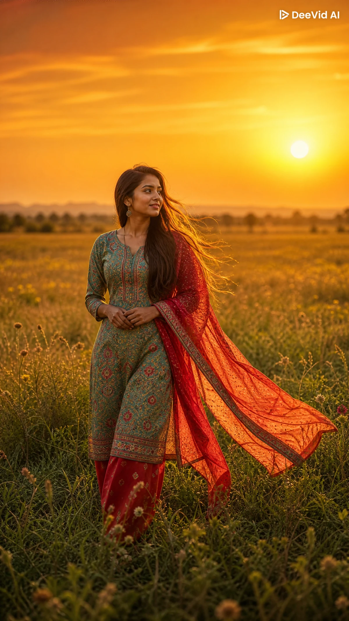
I generated the image, and the result delivered on the brief: an Indian girl in an embroidered teal salwar kameez and a vivid red dupatta caught mid-flow, walking through a sunlit field as the sun sat low on the horizon. The warm cinematic lighting, the detail in the fabric, and the natural pose all held up when I looked closely. The quality landed high, and the turnaround time for that level of detail was impressively short.
What I liked
- Zero barrier to start: the landing page kept the focus on one action, with nothing standing between me and typing an idea.
- Everything sat in one place: video, image, audio, and more in a single panel without feeling crowded, so it was easy to navigate.
- The generation step felt transparent. The "Choosing the best approach" message and the red stop control meant I wasn't staring at a black box and could halt anytime.
- The prompt enhancement was the real strength. It turned my rough one-line idea into a detailed, intentional brief, so the output looked deliberate even though my input wasn't.
- The setup was clear before committing: the card showed the model, ratio, resolution, and credit cost up front, with an Edit option to adjust first.
- The final output was high quality and fast. It held up under a close look, and the turnaround was short for that level of detail.
What I disliked
- Generation runs on credits: a credit counter, an Upgrade button, and a 6-credit cost per image meant it isn't truly unlimited despite the "Start For Free" framing, so heavier use would mean paying.
- The enhancement makes a lot of decisions for you. It added specifics (fabric, colors, sky, shadows) I never asked for. That's great for a vague prompt, but it could get in the way if I wanted tight control, though the Edit option does soften that.
- There's some marketing layered into the workspace, like the promo banner pushing newer models up top. It's minor, but it's pulling for attention alongside the actual tools.