
From Signup to Final Image: PicLumen Test
To test PicLumen properly, I used the platform like a normal first-time user. I checked the signup flow, model selection, prompt box, free credits, image generation quality, and final output. The goal was to see whether PicLumen is simple enough for beginners and whether its AI image results are actually usable for real projects.
Signup and Login Experience
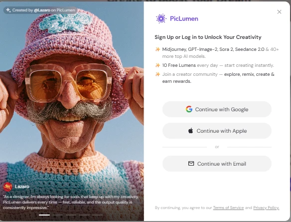
PicLumen starts with a clean signup screen. The platform clearly shows that users can sign up using Google, Apple, or email. It also highlights the free daily Lumens, which is useful for users who want to test the tool before paying.
The login popup looks modern and simple, but it also appears quite early, which may interrupt users who only want to explore the tool first.
What I liked:
| Point | Observation |
|---|---|
| Signup options | Google, Apple, and email login are available |
| Design | Clean, modern, and beginner-friendly |
| Free credits | 10 free Lumens daily are clearly mentioned |
| Trust factor | It tells users what models they can unlock after signup |
What I disliked:
| Issue | Why it matters |
|---|---|
| Login appears quickly | Users may want to explore more before signing up |
| Too much focus on signup | The creative tool is partly hidden behind the login wall |
Popular AI Models Section
The Popular AI Models section gives a quick preview of what PicLumen can do. It shows different models like motion control, creative image generation, and cinematic realism. This is helpful because users can understand the platform’s range before generating anything.
The cards are visually strong and easy to scan. However, for a new user, the model names may still feel a little confusing unless they already understand AI image models.
Testing note:
This section is good for discovery, but PicLumen could improve it by adding a simple “Best for” label on each model.
| Model Card | First Impression |
|---|---|
| Kling 2.6 Motion Control | Looks useful for motion and facial expression control |
| Nano Banana 2 | Looks more creative and experimental |
| Happy Horse 1.0 | Looks focused on cinematic realism and storytelling |
What I liked:
The visual cards make the platform feel premium and creative.
What I disliked:
Beginners may not immediately understand which model is best for their use case.
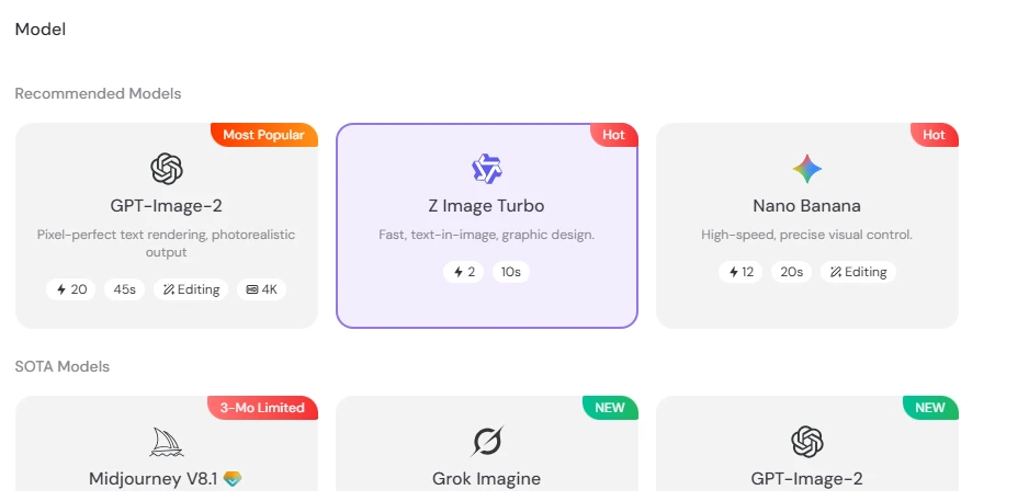
Model Selection Interface
I tested the interface by selecting Z Image Turbo, which was shown as a fast model for text-in-image and graphic design.
The cards also show useful details like generation cost, estimated time, editing support, and resolution options.
| Feature | Result |
|---|---|
| Model categories | Recommended and SOTA models are shown separately |
| Selected model | Z Image Turbo |
| Speed indicator | Around 10 seconds shown |
| Cost indicator | 2 Lumens shown |
| Editing support | Visible on some models |
| Ease of use | Very simple |
What I liked:
PicLumen makes it easy to understand the basic difference between models without opening multiple pages.
What I disliked:
Some model names are still not self-explanatory. A beginner may not know when to choose GPT-Image-2, Z Image Turbo, or Nano Banana.
Prompt Box and Image Settings
For the actual test, I entered this prompt:
“create an image for optical shop giving flat 20 percent discount to its old customers”
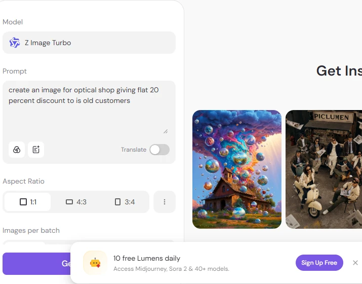
PicLumen’s prompt box is simple and easy to use. The platform also gives aspect ratio options like 1:1, 4:3, and 3:4. This is useful if you are creating images for social media, ads, or blog covers.
The interface also shows the selected model clearly at the top, which is helpful because users can confirm which AI model they are using before generating the image.
| Setting Tested | Observation |
|---|---|
| Prompt box | Easy to type and edit |
| Model selected | Z Image Turbo |
| Aspect ratio | 1:1 selected |
| Translation option | Available |
| Generate button | Easy to find |
| Free credit banner | Visible at the bottom |
What I liked:
The prompt area is clean and not overloaded with too many settings.
What I disliked:
The free Lumens banner takes space at the bottom and may feel distracting while working.
Email Verification Flow
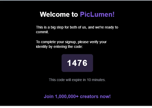
After signing up, PicLumen asks users to verify their email with a short code. This is a normal security step and helps protect the account. The verification email looks clean and matches the platform’s purple branding.
For privacy, users should avoid sharing screenshots that show their real email or verification code publicly.
| Verification Step | Result |
|---|---|
| Email verification required | Yes |
| Code format | Short numeric code |
| Expiry time | 10 minutes |
| Email design | Clean and branded |
| User friction | Low |
What I liked:
The verification process is simple and quick.
What I disliked:
Users who want instant access may find email verification slightly annoying, but it is acceptable for account security.
Referral and Free Lumens Popup

PicLumen also shows a referral popup where users can invite friends and earn free Lumens. This is useful for people who want to generate more images without paying immediately.
The popup design is attractive, but it appears like a promotional layer over the workspace. For serious users, this can feel slightly interruptive.
| Feature | Observation |
|---|---|
| Referral system | Available |
| Reward type | Free Lumens |
| Design | Bright and friendly |
| Usefulness | Good for free users |
| Distraction level | Medium |
What I liked:
It gives users a way to earn more free credits.
What I disliked:
The popup can interrupt the workflow if it appears while testing the tool.
Final Image Output Quality
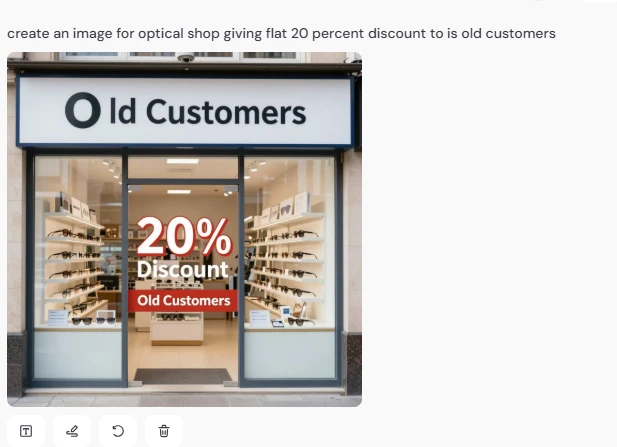
For the final image test, I generated an optical shop discount image using the prompt about a 20% discount for old customers. The result was visually clean and looked like a real storefront ad. The optical shop background was clear, and the discount text was visible.
However, the text accuracy was not perfect. The output showed “Old Customers”, but the shop sign looked slightly awkward, and the wording placement could be better. This is common with AI image tools, especially when generating text inside images.
| Output Area | Result |
|---|---|
| Visual quality | Good |
| Shop design | Clean and realistic |
| Discount message | Understandable |
| Text accuracy | Average |
| Business usability | Usable after minor editing |
| Prompt following | Good, but not perfect |
What I liked:
The image clearly communicates an optical shop discount offer. The storefront looks professional, and the 20% discount is easy to notice.
What I disliked:
The text rendering still needs improvement. For real business use, I would edit the final image manually before publishing it.