
Recraft in Practice.
I ran every test on the free plan with a Google login. Recraft credited my account with 60 credits the moment I signed in, and it never asked for a card.

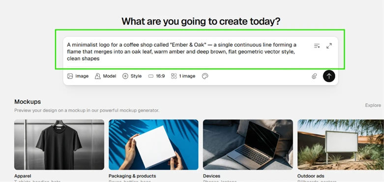
My first test went straight for the feature Recraft built its name on, which is native vector output. I asked for a single continuous-line logo for a fictional coffee shop.
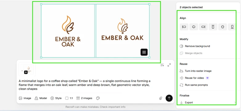
The output held up. Recraft returned two logo variations as true SVGs, and the panel on the right carried genuine editing controls: alignment tools, background removal, a raster conversion, and a reuse-for-video option. Typography came through clean. “EMBER & OAK” sat crisp beneath both marks with no warped or missing letters, the exact spot where most generators break down.
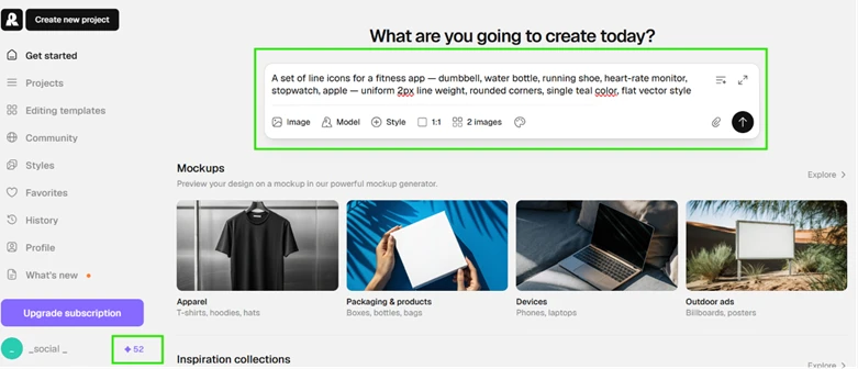
I moved on to test consistency across a set, which matters more for brand work than any single image can show. By now the prompt bar read 52 credits, down from 60, so those two logos had cost me 8. At that rate the daily free allowance covers roughly seven generations before it runs out.
One thing about the controls caught my eye before the results even landed. I had set the ratio to 16:9 on the logo run, yet every vector came back as a 1:1 square, and I received two images while the counter showed one. For vector styles the square output looks like a deliberate constraint. The interface still lets you choose a ratio it quietly overrides, which is confusing.
The icon test produced the strongest result of the session. I asked for six fitness icons locked to a single line weight and one color.
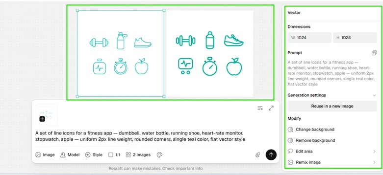
Every icon matched. The dumbbell, the bottle, the shoe, the heart monitor, the stopwatch, and the apple all shared the same teal stroke and rounded corners at a uniform weight. This is production-grade output a designer could drop into a UI kit without redrawing anything.
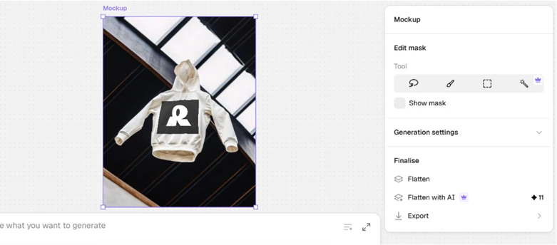
The mockup tool is where the session lost momentum. I applied the Recraft logo to a hoodie template and the print looked stuck on rather than printed. The mark sat as a flat black rectangle with none of the texture or fold distortion you would get from real fabric.
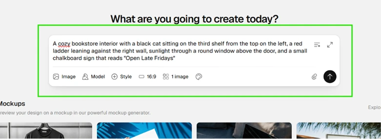
My last test pushed a crowded prompt with exact spatial instructions to find the ceiling. I asked for a bookstore interior carrying four specific elements.
The result splits down the middle. Recraft placed the round window correctly above the door, and it stood the red ladder against the right wall as instructed.
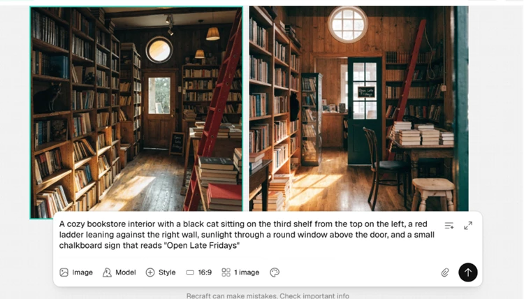
Where it slipped was the fine detail. The black cat does appear on the left shelving, but perched around the middle of the unit rather than the third shelf from the top I asked for. The chalkboard sign is the clearest miss. Instead of a clean “Open Late Fridays,” the lettering came out warped and only half readable, the small embedded-text weakness that still trips up most models.

The square-crop problem returned here on a raster image, not a vector, which tells me the ratio picker is unreliable across the board rather than a vector-only quirk. Recraft got the large spatial relationships right and lost points on precise counting and tiny text.