
Practical Assessment
I created a fresh Figma account and went through the entire onboarding flow from the sign-up page to the first file. Then I gave Figma Make a one-line prompt to see what the AI side can do without any hand-holding. Below is what each step looked like and what I made of it.
Signing Up
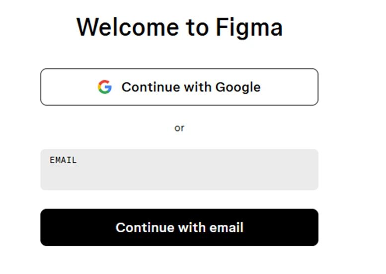
The Figma welcome screen: Google or email, nothing else
Two ways in, nothing more
The welcome screen offers Google or email and that is the full list. No Apple, no Microsoft, no GitHub. I went with email because I wanted to see every step of the flow. The page is stripped down almost to the point of being bare, and I liked that. There is no marketing copy competing for attention, just a heading, a button and a text field.
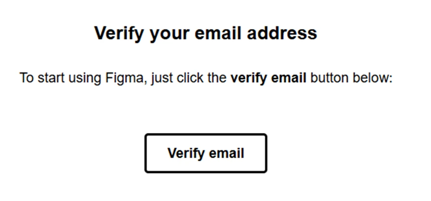
The verification email is a single button
The verification email
The email landed within seconds and contained exactly one button. That is how it should work. My only gripe is that the email itself looks like a placeholder. It reads more like a system notification than something a design company sent out. Not a big deal, but a slightly odd first impression coming from Figma of all companies.
My take
A clean start. Fast, no friction, and no upsell before you have even seen the product.
The Onboarding Questions
Typ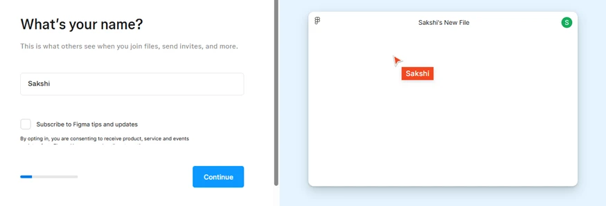 ing your name updates the preview file on the right in real time
The live preview is a nice touch
As you type your name, the mock file on the right updates with your cursor label and avatar. It is a small thing but it made me smile, and it quietly teaches you how multiplayer cursors work before you have opened a single file. The tips-and-updates checkbox is unticked by default, which I appreciated.
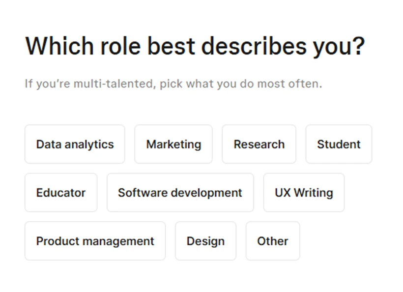
Ten role options to pick from
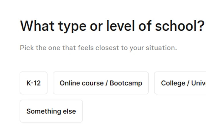
Choosing Student triggers a follow-up about school type
Role and school
The role picker has ten options and covers the usual suspects. I chose Student to see where it would lead, and it followed up with a question about school type. Fair enough, since that decides whether you get shown the Education plan later. What I did not love is that I could not spot a skip option anywhere. If you are only poking around, being asked to categorise yourself twice starts to feel like homework.
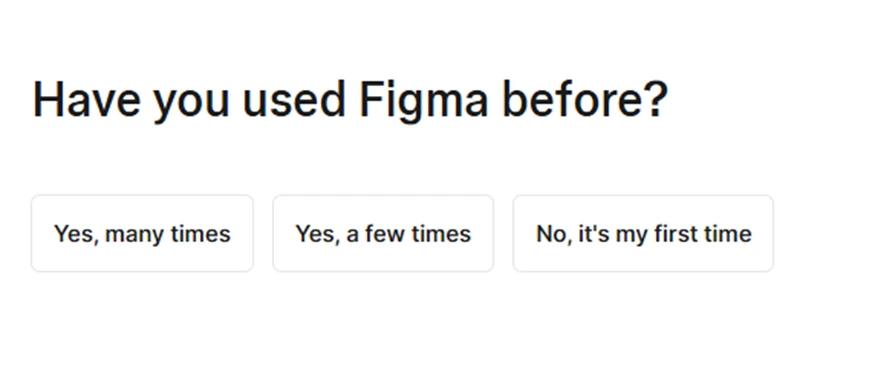
One more question before you reach the app
Where it started to drag
Then it asked whether I had used Figma before. By this point I had answered four questions and still had not seen the actual product. Each question is quick on its own, but together they add up. I understand why Figma wants the data, but a Skip link on every screen would cost them nothing and would make the flow feel a lot more respectful of the user's time.
Picking a Plan
Starter, Education and Professional side by side
Three cards, one clear nudge
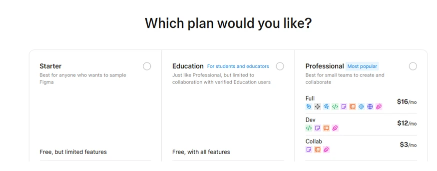
Starter, Education and Professional sit next to each other, with Professional tagged as Most popular. Because I had said I was a student, the Education plan was right there in front of me. It is free with all features, with the only limit being that collaboration is restricted to other verified education users. That is a good deal and Figma does not bury it.
The seat types are the confusing part
Under Professional there are three seat types: Full at $16 a month, Dev at $12 and Collab at $3. Each has a row of tiny coloured icons that are supposed to explain what is included, but without hovering over every one of them they are just decorative shapes. A new user with a real budget would have to open the pricing page in another tab to understand what they are buying, which defeats the point of showing the options here at all.
Did I feel pushed to pay?
A little. The Most popular badge is a nudge, and the Starter card is deliberately vague about what limited features actually means. But Starter is selectable and I moved on without entering a card, so it is a soft push rather than a wall.
Choosing What to Build
Six starting points for a new file
Six starting points
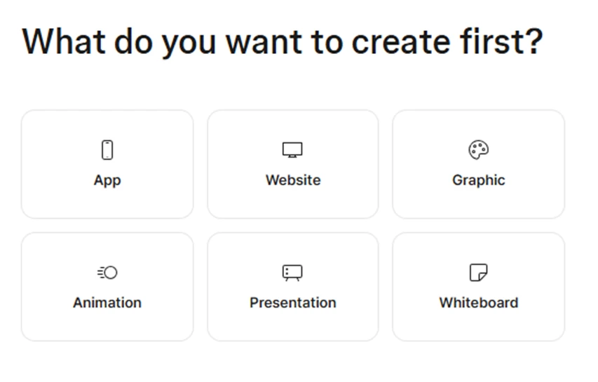
App, Website, Graphic, Animation, Presentation, Whiteboard. The icons are clear and the grid is easy to scan. I picked App because I wanted to test Figma Make. What struck me here is how far Figma has moved from being a design and FigJam tool. It is now openly pitching itself as a place to make slides and social posts, not only interfaces.
A second layer of choices: templates in Figma Buzz or drawing in Figma Draw
Templates or a blank canvas
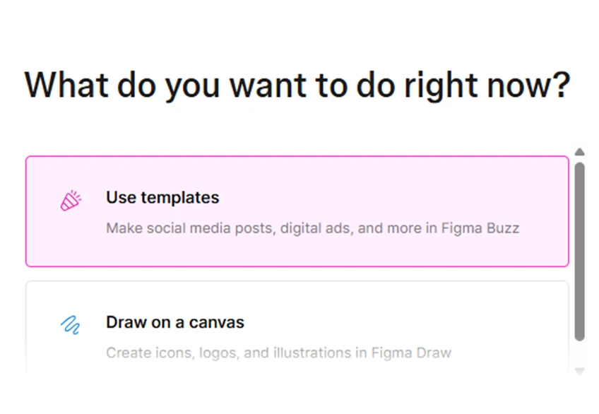
The next screen narrows things down again with options like using templates in Figma Buzz or drawing in Figma Draw, with a few more below the fold. This one felt redundant after the previous question, and the two screens could easily be merged into one. On the plus side, the one-line descriptions are useful because Buzz and Draw are new product names that most people will not recognise yet.
Testing Figma Make

The prompt bar for Figma Make
The prompt I used
A single input bar appears with an AI label and a Make a file button. I kept it simple: build a habit tracking app with a daily checklist and a weekly progress chart. One sentence, no design direction, no colour preferences, no font choices. I wanted to see what it does with almost nothing to go on.
What happens next
It thinks for a moment, then starts editing files in the background. You can watch a running log of what it is touching, which I liked because the process does not feel like a black box. From hitting the button to seeing a finished screen took a couple of minutes. I did not have to touch a component, pick a font or open a design file at any point.
The Finished Habit Tracker
The generated Daily Habits app and the change log beside it
First look
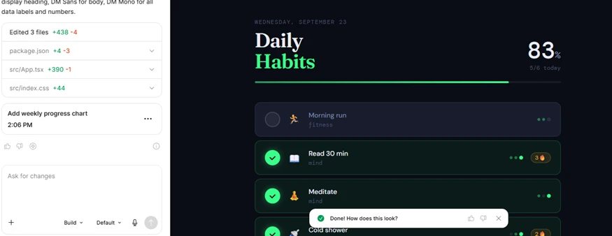
The output is a dark-themed app with a serif display font for the heading, DM Sans for the body and DM Mono for the numbers. It shows the date, a completion percentage, a progress bar and a list of habits with categories and streak counters. It looks like something a real designer put together, not a wireframe with placeholder boxes. That was the moment the tool won me over.
The change log panel
On the left it lists exactly what it edited: package.json, App.tsx and index.css, with added and removed line counts for each. The follow-up request to add the weekly progress chart is logged with a timestamp. You can ask for more changes in plain language from the same box or switch into Build mode. Anyone who has used Cursor or Lovable will feel at home here straight away.
What is missing
The weekly chart was not visible on the first screen, so I would need to scroll or ask it to move the chart up. The habits are placeholders too (morning run, read 30 min, meditate, cold shower), so this is a demo rather than something you could use as is. It is also worth remembering that this is React code, not a Figma design file. You will not be dragging these elements around on a canvas the way you would in a normal Figma document.
Final verdict
The onboarding is longer than it needs to be and the plan screen could explain itself better. But going from a single typed sentence to a polished, working app in a couple of minutes is impressive, and Figma Make delivers on that promise. If you are a designer who has been curious about AI app builders but did not want to leave Figma to try one, this is a good reason to sign up.