
I Spent an Afternoon Inside Magnific. Here Is What I Found
I first came across Magnific as the AI upscaler that could rescue a blurry 512-pixel render and make it printable. So when I saw the site now calling itself "the creative platform to direct your best work", with every AI model for video, image and audio under one login, I wanted to see for myself whether that claim holds up or whether I was looking at a good upscaler wearing a much bigger coat.
What follows is my first-run experience, from the landing page all the way to the pricing page. I am not benchmarking output quality here; I am telling you what it felt like to sign up and start using the thing. After every screenshot I have written down what I liked, what I didn't, and where I landed.
First Impressions
The homepage hit me with a full-bleed hero, a rotating list of things I could apparently do (generate images, shoot cinematic videos, build workflows, upscale video, direct photoshoots, cast characters, stay on brand) and a badge claiming the #1 spot in an a16z ranking of AI creative platforms. Two buttons, Start creating and Why Magnific?, and nothing else fighting for my attention.
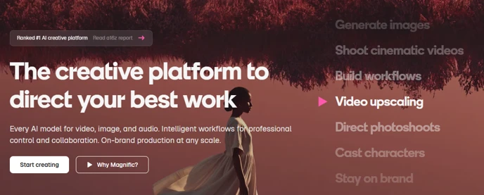
Figure 1: The Magnific landing page. The rotating capability list on the right cycles through seven use cases.
| WHAT I LIKED | I liked how clean and confident it is. The rotating use-case list told me in about five seconds that this is no longer just an upscaler, and the a16z badge is a smart trust signal for anyone who has never heard the name. |
| WHAT I DIDN'T | I found the hero copy to be all ambition and no proof. There is no sample output, no before-and-after, nothing I could judge with my own eyes before I committed to signing up. |
| MY VERDICT | A strong first impression, but I was being sold the vision rather than the results. One "see it in action" reel above the fold would have settled my doubts. |
Signing Up and Onboarding
I clicked Start creating and landed on a minimal account screen: Google, Apple or email. I went with Google and was inside within a few seconds, and nobody asked me for a card. The marketing opt-out is an unticked box that reads "I do not wish to receive news and promotions", which means I was opted in by default.
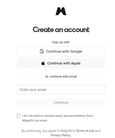
Figure 2: Account creation. Google, Apple or email; no credit card at this stage.
| WHAT I LIKED | I liked that it was fast, friction-free and had no payment wall. Google sign-in took me from the homepage into the app in well under a minute. |
| WHAT I DIDN'T | I did not like that the promotional email box is opted-in by default and worded as a negative. It is the classic pattern that gets you onto a mailing list without noticing, and I nearly missed it myself. |
| MY VERDICT | Painless entry. I would only knock them for the email checkbox, which I think is a small but deliberate nudge. |
The onboarding form that came next asked me for my name, a light/dark/system theme and, marked as required, how I found out about the product. I found the discovery options telling: YouTube, Facebook, friends, TikTok, X, Reddit, Discord, LinkedIn, live events, and one labelled "ChatGPT / Claude". They are clearly tracking how many people arrive via AI assistants.
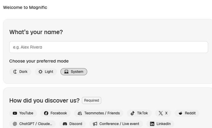
Figure 3: The onboarding questionnaire. Note the "ChatGPT / Claude" discovery option.
| WHAT I LIKED | I liked that it was two screens and done. Asking for my theme preference up front was a nice touch, and the whole thing respected my time. |
| WHAT I DIDN'T | I did not like being forced to answer "How did you discover us?". That is attribution data for their marketing team, not something that helps me, and I should have been able to skip it. |
| MY VERDICT | Short and sensible. If they dropped the required flag I would call this textbook onboarding. |
The Dashboard
The home screen greeted me by time of day and put a universal search bar in the middle ("Ask Magnific or find tools", Ctrl+K). Below it I counted eight tiles: Spaces, Image, Video, Audio, Design, 3D, Stock and All tools. A strip underneath advertised the other places Magnific lives: a Desktop app (marked New), Mobile, an MCP connector, Photoshop and Figma plugins, and an API. The left rail listed Home, Search, Stock, Explore, Projects, Library and then every individual tool. My projects were split into Personal (free) and Team project (locked behind an upgrade), and a 25% annual-discount banner sat at the very top where I could not miss it.
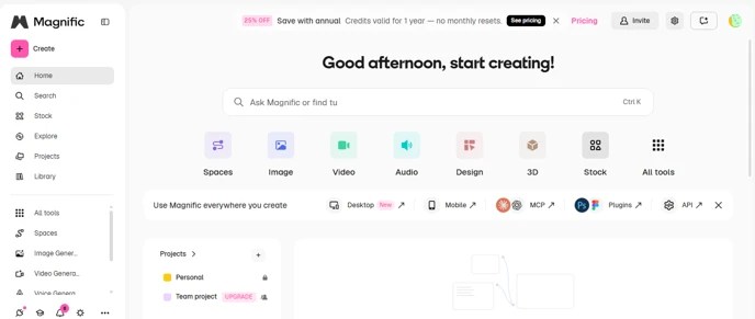
Figure 4: The dashboard after first login. Eight tool categories, plus desktop, mobile, MCP, plugin and API entry points.
| WHAT I LIKED | I liked how broad it is. Image, video, audio, 3D, design and a stock library all under one roof, plus an MCP endpoint and Photoshop/Figma plugins for anyone who wants Magnific inside their existing workflow. The Ctrl+K command palette felt like the right way to navigate a tool this big. |
| WHAT I DIDN'T | I found it a lot to take in on day one. Eight tiles, a long left rail, an integrations strip and a sales banner all fired at once, and nothing guided me to a first task. The upscaler that made Magnific famous was nowhere on the home screen; I had to dig for it. And the Team project lock and the upgrade banner started selling to me before I had generated a single pixel. |
| MY VERDICT | Impressive scope, but the home screen behaved like a catalogue rather than a starting point. I would have appreciated a "try this first" path. |
Building a Template
The most interesting workflow feature I found was Save template. I picked a model from a dropdown (Google Nano Banana 2 was the default), attached a style and reference images, then wrote a prompt that referenced those images with handles like @img1. I could scope the template to specific projects and share it with named members or groups, and there was a preview pane that stayed empty until I had run it once.
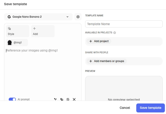
Figure 5: The Save template dialog. Reference images get @img1-style handles you can call in the prompt.
| WHAT I LIKED | I liked this the most. Locking a model, a style and a set of reference images into a reusable, shareable template is exactly what I would want for keeping output consistent across a content team, and the @img1 referencing was clean and obvious to me straight away. This is the feature that justifies the "direct your work" language. |
| WHAT I DIDN'T | I found the dialog a little cramped, and the preview pane is dead space until you generate something. Sharing with members or groups is shown, but on my Personal-only account it just reminded me of what I was not paying for yet. |
| MY VERDICT | The strongest thing I saw all afternoon. If you produce the same kind of image repeatedly, I think this alone is worth a look. |
Pricing and My Final Verdict
I found two individual plans, shown here with the annual toggle on. Premium is ₹910 a month billed annually (₹1,340 monthly), and comes with Spaces, access to 250M+ premium stock assets and 240K credits a year. Premium+ is ₹2,250 a month billed annually (₹3,000 monthly), and adds unlimited generations, 600K credits a year and unlimited use of Nano Banana 2 at 1K resolution. Both promise no model training on my data, and the banner at the top of the dashboard made clear that credits on the annual plan are valid for the full year with no monthly reset.
| WHAT I LIKED | I liked seeing Indian-rupee pricing with a real 25% annual discount, a clear no-training-on-my-data promise and credits that do not evaporate at month end. Premium+ at ₹27,000 a year for unlimited generations looks competitive to me against paying for image, video and stock tools separately. |
| WHAT I DIDN'T | I did not like that Premium at ₹910 a month is really a stock-library plan with a credit allowance; the "unlimited" headline only starts at Premium+. "600K credits" meant nothing to me until I knew what one video second or one upscale costs, and that was not on this screen. Team collaboration is a separate tier again. |
| MY VERDICT | Fair for what it bundles, but I would do the credit maths for my own workload before committing to the annual plan. |
Where I landed: Magnific has outgrown its upscaler roots, and what I used felt like a broad, well-built creative suite with a few standout ideas, templates and the MCP/plugin integrations chief among them. Onboarding was quick, the pricing was transparent enough, and nothing I touched felt half-finished. Where it stumbled for me was focus: the home screen threw everything at me at once, and the plan that sounds affordable is not the one that delivers the headline features.
Would I recommend it? Yes, if you are an individual creator or a small team who will use more than one media type. If, like me, you only ever wanted the upscaler, the new platform is more than you need.