
Expectations I Had Before Using Remaker AI
I Expected The Tool Library To Feel Overcrowded
Before I Tried It
Before opening Remaker AI, I expected the first screen to feel busy. The platform promotes face swap, background removal, upscaling, Magic Eraser, AI photo editing, image generation, portraits, tattoos, and video tools. That kind of range can be useful, but it can also make a new user feel unsure about where to begin.
What The Screen Reveals
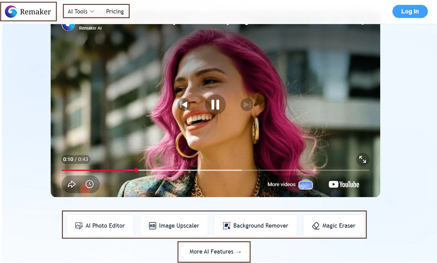
The screen shows Remaker AI as a broad creative toolkit rather than a single-purpose editor. I can see multiple tool cards grouped around image editing, enhancement, generation, and effects. The layout is visual, with each feature presented as a separate entry point instead of hiding everything behind one large editor. The homepage does not ask me to understand technical terms first. It gives me recognizable tasks: remove a background, upscale an image, erase something, generate an image, or edit a photo. From the first screen, the platform feels more like a toolbox than a blank creative canvas.
Reality Check
My expectation has partly changed here. I thought the number of tools might make the platform harder to understand, but the homepage made the main use cases easy to scan. The bigger issue was not confusion; it was deciding which tool belonged to which job. For example, object removal could lead me toward Magic Eraser or AI Photo Editor, while enhancement could mean Upscaler, Unblur, Enhance, or Portrait mode. The interface is beginner-friendly at the surface level, but the tool overlap becomes noticeable once I start thinking like an editor instead of a casual user.
One Unexpected Detail
The platform does not feel like one editor with many panels. It feels like several small editors connected through a shared site. That makes the first click easier, but it also means users may jump between tools before finding the best one for a specific edit.
I Expected Background Removal To Be The Most Practical Free Tool
Before I Tried It
Background removers are usually the easiest AI editing tools to judge because the result is either clean or visibly messy. I expected Remaker AI’s background remover to be one of the most useful free features, especially for product photos, profile images, and simple social media graphics.
What The Screen Reveals
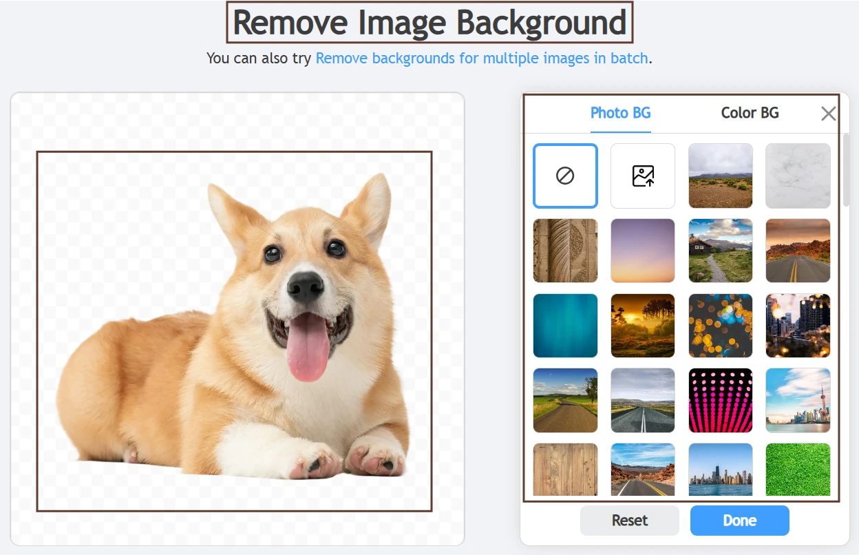
The screen makes the background remover feel like a focused utility rather than a full design editor. I can see the uploaded image area, the processed preview, and the output controls around the result. The transparent background is the main visual signal, so readers can immediately understand what changed. If a background color or replacement option is visible, it shows that the tool is not only removing the background but also preparing the image for reuse. The screenshot works best when the subject edge is visible enough to judge.
Reality Check
My expectation was mostly confirmed. This is the kind of feature where Remaker AI’s simple interface works in its favor. There is not much to learn, and the result can be evaluated quickly. The free experience feels more practical here than in broader creative tools because the user goal is narrow. The main limitation is precision. On simple subjects, the workflow feels quick and useful. On complicated edges, the screenshot should show whether the tool preserved fine details or left small cutout issues. That difference matters more than the marketing claim.
One Unexpected Detail
The background remover is a good screenshot feature because readers do not need much explanation. A transparent preview, a visible subject edge, and a download button can communicate the whole experience without turning the review into a technical breakdown.
I Thought Magic Eraser Would Be One Click, But Not Fully Hands-Off
Before I Tried It
Object removal tools usually sound effortless until the unwanted object touches something important in the photo. Before testing Magic Eraser, I expected Remaker AI to make selection easy, but I also expected the final quality to depend on how cleanly I marked the object.
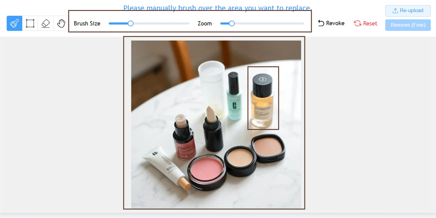
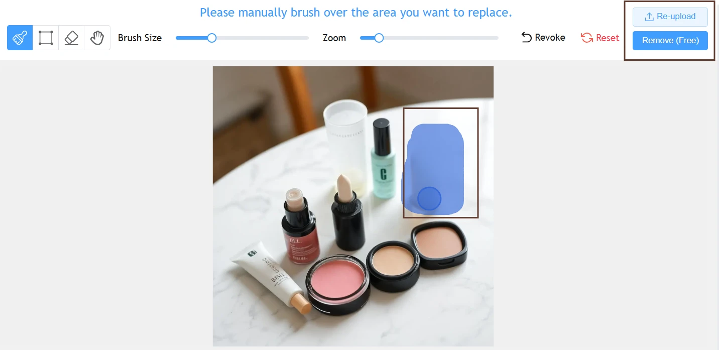
What The Screen Reveals
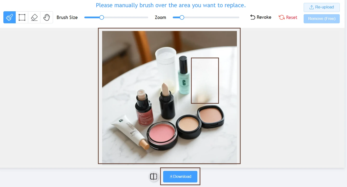
The screen shows a more hands-on workflow than the background remover. I can see the uploaded image, the area selected with a brush, and the controls used to tell the AI what to remove. This makes the screenshot feel more active because the edit is not happening completely automatically. The selected region is an important visual element. It shows the reader exactly what I asked the tool to change. If the after-image is placed beside it, the screenshot also shows whether the tool filled the removed area smoothly or left visible texture artifacts.
Reality Check
My expectation was confirmed. Magic Eraser is easy to start, but it is not magic in the sense of reading my mind. The tool depends on the selection I make, and that makes the brush step important. I liked that the workflow stayed simple, especially for small distractions. The disappointment is that there is not much room for fine correction inside the same flow. If the first removal is imperfect, the practical fix is usually to retry with a better selection rather than manually repair the image inside Remaker AI.
One Unexpected Detail
The brush step makes the tool feel more trustworthy because I can see the instruction before generation. It also exposes the limitation: the cleaner my selection is, the fairer the test becomes. A sloppy brush mark can make the AI look worse than it is.