


Testing the Workflow
Starting With the Main Chat Screen
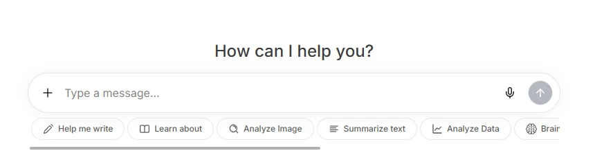
The first screen feels clean and direct. There is a large message box in the center with quick action buttons below it, such as Help me write, Learn about, Analyze Image, Summarize Text, and Analyze Data.
This makes the tool look easy for beginners because users can quickly understand that it is not only for chatting, but also for writing, learning, analyzing images, summarizing text, and working with data.
My observation:
The interface is simple and easy to start with. A new user can immediately type a prompt or choose one of the shortcut actions.
Login Requirement Before Using More Features
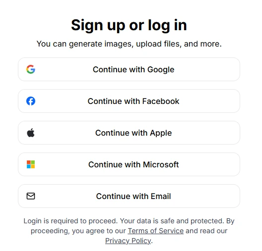
After clicking further, the tool showed a Sign up or log in screen. It gives multiple login options, including Google, Facebook, Apple, Microsoft, and Email.
This is useful because users can choose whichever login method is easiest for them. The screen also mentions that login is required to proceed and includes Terms of Service and Privacy Policy links.
My observation:
The login screen is clean and easy to understand. The multiple login options are helpful.
One issue I noticed:
The tool does not allow users to freely test everything before logging in. This may feel restrictive for users who only want to explore the platform first.
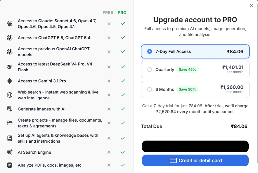
Pro Upgrade Screen and Locked Features
The upgrade screen clearly shows what users get in the Pro version. It lists access to premium AI models, web search, image generation, file analysis, projects, AI agents, and AI search.
The pricing screen also compares Free and Pro access, which makes it easy to understand what is locked.
My observation:
The comparison layout is clear, and users can quickly see what they unlock after upgrading.
The biggest drawback I noticed is that many core features are placed behind the Pro plan, so free users may not get enough room to properly test the tool before paying.
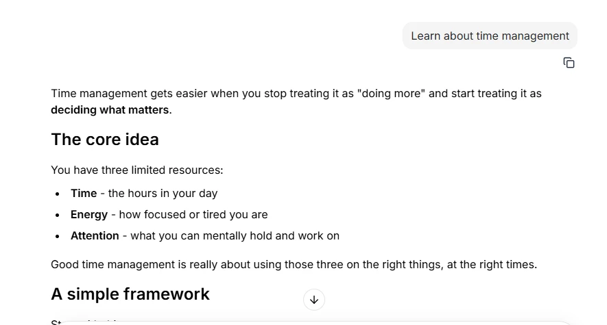
Testing a Basic Prompt
I tested the tool with a simple prompt:
“Learn about time management.”
The response was structured and easy to read. It used headings, short paragraphs, and bullet points. The answer explained time management through three main resources: time, energy, and attention.
My observation:
The answer quality was good for a beginner-level explanation. It gave a clear starting point without making the topic complicated.
One thing that could be better:
The answer could be more practical. It would be stronger if it included a sample daily schedule, time-blocking table, or real-life example.
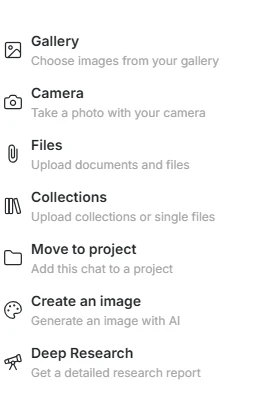
Upload and Extra Tools Menu
The plus menu opens several options, including Gallery, Camera, Files, Collections, Move to project, Create an image, and Deep Research.
This makes the tool feel more powerful than a basic chatbot because users can work with images, files, projects, and research from one menu.
My observation:
The menu is useful and gives the tool more flexibility.
Scorecard
| Area Tested | Score |
|---|---|
| Chat interface | 4.2/5 |
| Login experience | 3.8/5 |
| Free plan access | 3.2/5 |
| Pro feature clarity | 4.1/5 |
| Prompt response quality | 4.3/5 |
| Tools/upload menu | 4.1/5 |
Overall Rating: 4.0/5
The tool is clean and easy to use, with good response quality. But the free version feels limited because many useful features are locked behind Pro.